
When you have printed a specific source color or a spot color, it can be required to check if the reproduced color is the close enough to the source color. Or, you maybe want to know how accurate the printer reproduces colors on specific media in general. Therefore, you need to know how to express and calculate a color difference.
This topic describes several calculation methods and explains how they can be used in color evaluations.
The comparison of colors always occurs in the same device-independent color space, such as the CIELAB color space. You literally can draw a line between two colors in a CIELAB color space to show how close or different they are. Therefore, a color difference is also named the distance between colors. The CIELAB color space represents the colors as we see them. A value that describes the difference automatically indicates if the difference will likely be visible or not.
The difference between two colors or two groups of colors can be expressed by a color metric. This topic first describes the CIELAB color spaces and then describes the color metrics that are derived from them.
The CIELAB color space has been developed by the Commission Internationale d'Eclairage (CIE) and represents a three-dimensional sphere in which every color is unique by its location. The Lab color value describes the location of the color in the CIELAB color space.
The varioPRINT iX-series profiles, color validation tests, spot color libraries, and media family calibration use the CIELAB color space to define color values and color differences in a device-independent way.
To read the CIELAB color values of printed colors, you use a spectrophotometer. PRISMAsync Print Server software can process the measured Lab values into further calculations.
There are two variants of the CIELAB color space: CIE L*a*b* and CIE L*C*h*.
The CIE L*a*b* color space is used to describe colors and to make color differences visible. The CIE L*a*b* color space is based on the fact that the human eye transforms visual information into three signals: light - dark, red - green, and yellow - blue.
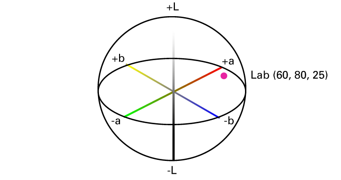 CIE L*a*b*
The CIE L*a*b* color space components are the following:
L* - the lightness component ranges from 0 to 100.
a* - the red - green component, where +a* indicates red, and -a* indicates green, ranges from -128 to +127.
b* - the yellow - blue component, where +b* indicates yellow, and -b* indicates blue, ranges from -128 to +127.
The CIE L*C*h* uses L*, C*, and h* components where the C* and h* components are calculated from the a* and b* coordinates of the CIE L*a*b* model.
A color has the same location in CIE L*C*h* and CIE L*a*b*, but uses different notations.
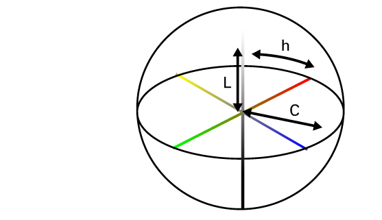 CIE L*C*h*
The L*C*h* color space uses the following components:
L* - the lightness component ranges from 0 to 100. The L* component is the same as in L*a*b*.
C* - the chroma component, the distance from the lightness axis, ranges from 0 at the axes to more than 100 at the edge.
h* - the hue angle, expressed in degrees, where 0° means the location on the +a* axis and 180° means the location on the +a* axis.
The most general metric to express the difference between two colors in CIELAB is Delta E. The Delta E value predicts how the human eye perceives the color difference.
Delta E does not always give enough information about differences between colors. Therefore, most color evaluations also use other metrics. The interpretation of a Delta E value remains subjective. The impact of a certain Delta E value depends on the application and even on the color. For example, the human eye can better distinguish a difference between grayish colors than between highly saturated colors.
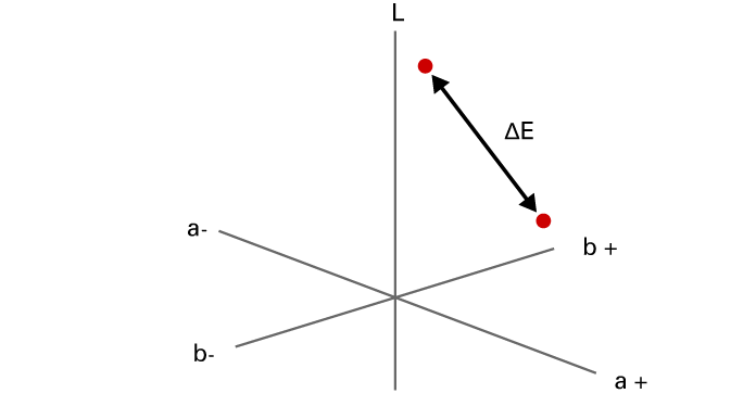 Difference between two colors in CIELAB
 The following Delta E range illustrates how the values of Delta E may be interpreted for a specific color evaluation.
Delta E smaller than 1 is not visible by the human eye.
Delta E between 1 and 2 is visible through close observation.
Delta E between 2 and 10 is visible at a glance.
The printer uses two variants of Delta E:
Delta E 2000, △E00, the industry standard.
Delta E 1976, △E76, based on a less complicated and accurate distance calculation.
To indicate more color difference information than the total color difference Delta E, the hue error △H (Delta H) is used.
You can imagine Delta H as which color difference is left over when the lightness and the chroma differences are ignored.
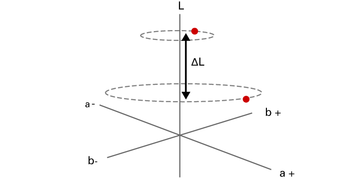
△L (Delta L) is the lightness difference between the two colors. |ΔL| is the absolute value of △L (Delta L).
The weighted |ΔL| puts more emphasis on the color differences for light grays, where the K value is lower than 50%. The goal of weighting is to reduce the importance of the lightness factor for very dark grays. The human eye usually does not identify errors in the very dark gray color area. This weighting definition is in accordance with the IDEAlliance G7 specification.
Close to the gray axis, in other words for near neutral colors, the usage of Delta H is not appropriate enough. Instead, the usage of the △Ch (Delta Ch) metric is proposed.
The metric that is called chromaticness can reveal gray balance errors.
The weighted ΔCh puts more emphasis on the color differences between composite grays, where C is lower than 50%. The goal of weighting is to reduce the importance of the gray balance for very dark grays. These dark grays errors are difficult to handle and are usually printed with black ink. This weighting definition is in accordance with the IDEAlliance G7 specification.