
This section will briefly explain the user interface of PRISMAlytics Accounting.
This documentation uses "app" to describe one standalone application, or one module, or a single functionality. PRISMAlytics Accounting is an application, and [Devices] is an app.
The browser page is split into 3 main parts: the header, the card dock, and the actual workspace.
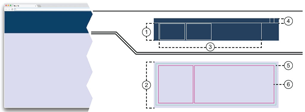
Dock
The dock, right below the header, keeps track of running apps. Each started app will add its own card in the dock. Each card will change its content when the app status changes. When one app needs to signal an error, the card will receive a red border. Like a bookmark, you can switch between running apps by clicking the corresponding card. When you close a card, you also close the app. Should you have more cards in the dock, a horizontal scroll will be added.
You can reduce the size of the card dock, reducing the cards to one line of status.
Workspace
The Workspace is most of the screen area. This is where most of the things happen.
Card
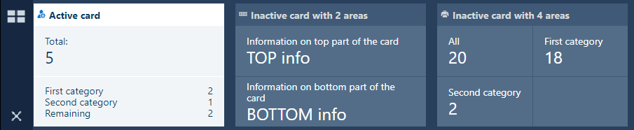
The Card provides very brief, specific information to be displayed in the Dock. Most apps only open a single card in the dock on the first call.
Header
The Header provides access to login or logout, user preferences, language selection and help.
 NOTE
NOTE
You cannot resize the header.
The header contains the
 icon which links to the main dashboard of PRISMA Home.
App
The actual App - will take as much space as possible inside the workspace. You can combine more than one app in the workspace.
Panels
Depending on the app, the displayed information can be split into one or more Panels. You can toggle the visibility of a panel (as long it's not the last one). You can also discard any of the changes in the layout and position of the panels inside the app using the [Reset to default] menu entry under the vertical ellipsis
 top right-hand side corner.
The dock manages the running apps.
When you select one app from the app menu, a new app card with a new workspace is open.
If you need more screen for the workspace, drag the bottom of the dock to the top. This will lead to the dock collapsing to a single line (the title of the card).

The order of the cards in the dock is kept when you log out and log in again.
The card dock menu manages the card inside the card dock.
The card dock menu contains, at minimum, one button for the dashboard, and one for the app menu.

The dock contains buttons to open/collapse the dashboard and app menu, as shown in the illustration above.
 The app menu is locked in the open position. The app list is always visible.
 The app menu is collapsed. The app list is hidden until you press this button.
You can reduce the size of the card dock, reducing the cards to one line of status. In this case, the icons of the card dock menu will be arranged horizontally.
If you have more cards than the dock can show, the card dock menu will add one or two navigation arrows.
 Navigation arrow
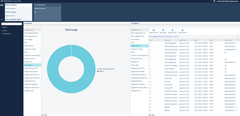
Regular cards are assigned to a single workspace. A small number of workspaces can be joined together. Such an example is the [Reports]. You can combine two instances of the same app in a single workspace. As a consequence, the card will also reflect this.
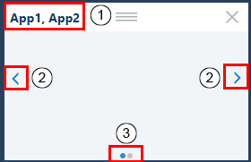
You can drag and drop one app from the app menu into the currently active workspace. This way of use will let you combine two or more apps into the same workspace. The card will then respond to change requests from all the apps.
The card header will receive the names of the apps, separated by a comma.
Double-click to change it.
On both lateral edges, arrows will allow you to switch from the card of one app to a different one. The scroll order is given by the order in which you added the apps to the workspace.
Press < or > to navigate to the previous or to the next app in this workspace.
On the bottom of such card, a navigation indicator will be added: one point for each app in the workspace.
The current app has the navigation point highlighted.
The use of this functionality is highly dependent on the size of your display.
From the app menu, select your favourite apps.
Each app comes with its own workspace
Each app adds a card to the Dock. You can add a new app in the workspace of another running app by dragging the new app from the menu. This special case could force one card to contain information from both apps. You will have to scroll the card's content to switch from one app to the other one
The order of the cards in the dock is kept when you logoff and on again
The workspace has a title on the topmost position, usually being the name of the app. The title bar can be hidden, depending on the needs of the application.
All the tables have a header. If the header is visible, and ordering is enabled, the columns can be reordered. Simply drag a column to the desired spot.
The information in a table can be sorted in some of the tables (depending on the providing app). Click the header of a column to sort the whole content of the table using the values in that column once. A second ordering will reverse the sorting order.
The header of the table offers a context menu from the
button. From this menu, you can check which of the columns to be displayed by the table. The order in which this menu shows the column headers does not change. If you select the [Filter], each column header will receive one input box for content filtering for the values in that column only.
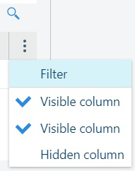
Right above the context menu, you can find the
 filtering button. If pressed, a small text box will allow you to search inside the table, in any of the visible columns.