
This section explains the user interface of PRISMAdrive.
The browser page is split into 3 main parts: the header, the card dock, and the workspace.
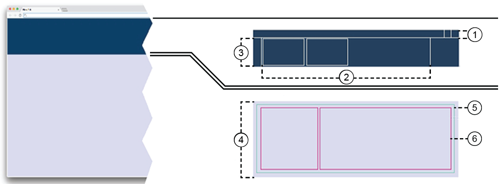
Header
The header provides access to login or logout, user preferences, language selection and help.
 NOTE
NOTE
You cannot resize the header.
Card
The card provides brief specific information to be displayed in the card dock. Most apps only open a single card in the card dock on the first call.
Card dock
The card dock right below the header keeps track of open workspaces.
Workspace
Opened apps are displayed in the workspace.
App
Apps provide information or allow you to perform actions on the printer. You can combine more than one app in the workspace.
Panels
Depending on the app, the displayed information can be split into one or more panels.
The user interface is dynamic and allows for customization. In order to move the elements in the user interface, long-press the mouse, or long-tap to release the element. Then the element can be freely dragged and dropped to a preferred position on the screen.
At the left-hand side of the user interface, you find the app menu.
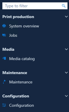
The app menu contains buttons to open or collapse the app menu.
The card dock manages the running apps.
When you select one app from the app menu, a new app card with a new workspace will open.
At any given moment, you will see one active card for the currently visible workspace and a number of inactive cards in the card dock area.
You can close apps from here.
Apps that require attention can be displayed in orange or red, depending on urgency.

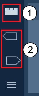 Card dock controls
It is possible to toggle between different card dock views. To change the view, click the top icon (1).
If you need more screen for the workspace, you can:
drag the bottom of the dock to the top;
click the top icon (1) once.
This leads to the dock collapsing to a single line (the title of the card).
 Collapsed card dock view
If you want to create a dashboard of apps to monitor and be able to quickly open an app, click the top icon (1) twice. Only the app cards will be displayed.
The order of the cards in the dock is kept when you log out and log in again.
If you have more cards than the dock can show, the card dock menu will add one or two navigation arrows (2).
The main area of the screen is called "workspace".
The workspace is connected to at least one app.
The workspace takes up the majority of the screen.
There is never unoccupied space inside the workspace. The information displayed by the workspace is grouped into rectangular panels. The workspace contains at least one panel.
If you resize the web page, the content of the workspace will try to keep the order of the contained content, but the workspace does not provide scrolling bars.
Every workspace has the three-dots menu
 in the top-right corner. The three-dots menu offers a number of options to customize your workspace or close the app.
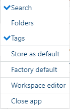 Three-dots menu
Regular cards are assigned to a single workspace, but workspaces can also be joined together.
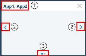 Card with 2 apps
 You can drag-and-drop one app from the app menu into the currently active workspace. This way two or more apps are combined into the same workspace. The card then responds to change requests from all the apps.
The card header will receive the names of the apps, separated by a comma.
Double-click to change the name of the card.
Arrows will allow you to switch from the card of one app to a different one.
Press < or > to navigate to the previous or to the next app in this workspace.
On the bottom of a card, a navigation indicator will be added: one point for each app in the workspace.
The current app has the navigation point highlighted.
The workspace is composed out of one or more panels. The panel consists of three areas: Header area, Title area, and Content.
Each panel can be freely moved to a different position in the current workspace with the help of workspace editor. To open the workspace editor, click the three-dots menu
in the top-right corner of the workspace and select [Workspace editor].
Three-dots menuYou can use a handle at the top of the panel to drag the panel to a different position. When rearranging occurs, a drop zone appears to give you a visual indication where it will be placed when the handle is released.
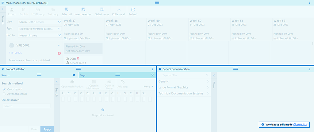 Workspace editor
Additionally, when the three dots menu
is clicked, a list with all the panels supplied by the app is shown. The visible panels are marked with a checkmark symbol. Additional entries in this menu are [Store as default] and [Factory default].
When you want to obtain the intended position for all the panels, select [Factory default] from this menu.
Select [Store as default] to save the current position of the panels as the new default.
If you want to close the app, select [Close app].
Each app can enable additional functionality for the table user interaction:
Context menu
The header of the table offers a context menu from the
button. From this menu, you can check which of the columns to be displayed by the table. The order in which this menu shows the column headers does not change. If you select the [Filter], each column header will receive one input box for content filtering for the values in that column only.
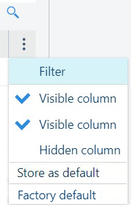 Table context menu
Column reordering
All the tables have a header. If the header is visible, and ordering is enabled, the columns can be reordered. Simply drag a column to the desired spot.
Data sorting
The information in a table can be sorted in some of the tables (depending on the providing app). Click the header of a column to sort the whole content of the table using the values in that column once. A second ordering will reverse the sorting order.
Column resizing
The column separator in the heading row can be dragged to set a different width for the column.
When the mouse cursor changes to the divider icon
 , you can use the mouse double-click gesture to automatically resize the column to the width needed to fully contain the longest value.