
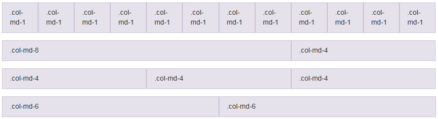
The area of the web shop can consist of a left and right area, center area, and a header and footer. The entire area is split in 12 columns using the bootstrap grid system which is part of CSS. For more information, see http://getbootstrap.com/css/#grid.
Bootstrap allows scaling for mobile devices. Bootstrap includes a responsive, mobile first fluid grid system that appropriately scales up to 12 columns as the device or viewport size increases. For more information, see http://getbootstrap.com/css/#grid-example-basic.
 NOTE
NOTE
You have to test your web shop for the expected display resolutions of your customers.
Large devices: large desktops, 1200 pixels and up.
Medium devices: desktops, 992 pixels and up.
|
Layout |
Number of column |
|---|---|

|
Left: 2 columns Right: 0 columns Center: 10 columns |

|
Left: 2 columns Right: 2 columns Center: 8 columns |

|
Left: 0 columns Right: 2 columns Center: 10 columns |

|
Left: 0 columns Right: 0 columns Center: 12 columns |
Small devices: tablets, 768 pixels and up
|
Layout |
Number of column |
|---|---|
|
|
Left: 1 column Right: 0 columns Center: 11 columns |
|
|
Left: 1 column Right: 1 column Center: 10 columns |
|
|
Left: 0 columns Right: 1 column Center: 11 columns |
|
|
Left: 0 columns Right: 0 columns Center: 12 columns |
Extra small devices: phones, less than 768 pixels
A fixed layout.
The height of the header is 48 pixels.
The height of the footer is 48 pixels.
No left and right columns.
The width of the center area depends on the device. For example, the width is:
375 pixels on an Apple iPhone 6
412 pixels on a Motorola Nexus 6