
This section will briefly explain the user interface of PRISMA configuration.
This documentation uses "app" to describe one standalone application, or one module, or a single functionality. PRISMA configuration is an application, and [Devices] is an app.
The browser page is split into 3 main parts: the header, the card dock, and the actual workspace.
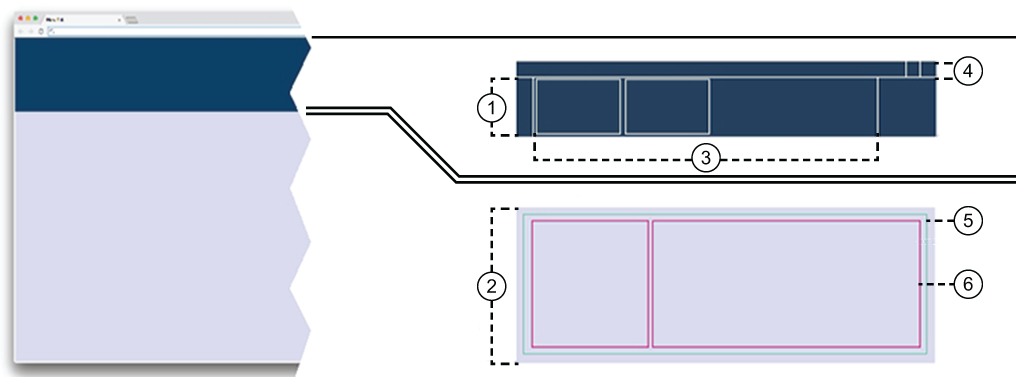
Dock
The dock, right below the header, keeps track of running apps. Each started app will add its own card in the dock. Each card will change its content when the app status changes. When one app needs to signal an error, the card will receive a red border. Like a bookmark, you can switch between running apps by clicking the corresponding card. When you close a card, you also close the app. Should you have more cards in the dock, a horizontal scroll will be added.
You can reduce the size of the card dock, reducing the cards to one line of status.
Workspace
The Workspace is most of the screen area. This is where most of the things happen.
Card
The Card provides very brief, specific information to be displayed in the Dock. Most apps only open a single card in the dock on the first call.
Header
The Header provides access to login or logout, user preferences, language selection and help.
 NOTE
NOTE
You cannot resize the header.
The header contains the
 icon which links to the main dashboard of PRISMA Home.
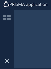
App
The actual App - will take as much space as possible inside the workspace. You can combine more than one app in the workspace.
Panels
Depending on the app, the displayed information can be split into one or more Panels. You can toggle the visibility of a panel (as long it's not the last one). You can also discard any of the changes in the layout and position of the panels inside the app using the [Reset to default] menu entry under the vertical ellipsis
 top right-hand side corner.
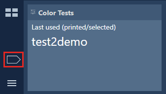
The card dock menu manages the card inside the card dock.
The card dock menu contains, at minimum, one button for the dashboard, and one for the app menu.
 The dock menu
The dock contains buttons to open/collapse the dashboard and app menu, as shown in the illustration above.
 The app menu is locked in the open position. The app list is always visible.
 The app menu is collapsed. The app list is hidden until you press this button.
You can reduce the size of the card dock, reducing the cards to one line of status. In this case, the icons of the card dock menu will be arranged horizontally.
If you have more cards than the dock can show, the card dock menu will add one or two navigation arrows.
 Navigation arrow
The dock manages the running apps.
When you select one app from the app menu, a new app card with a new workspace is open.
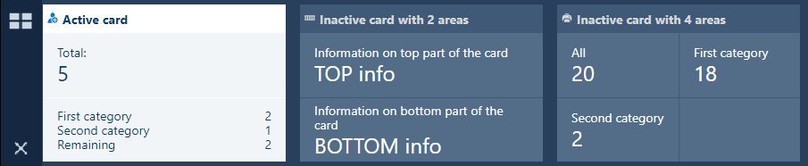 The expanded dock with examples of cards
If you need more screen for the workspace, drag the bottom of the dock to the top. This will lead to the dock collapsing to a single line (the title of the card).
 Collapsed dock
The order of the cards in the dock is kept when you log out and log in again.
The main area of the screen is called "workspace".
The workspace is connected to at least one app.
The workspace takes up the great majority of the screen.
There is never unoccupied space inside the workspace. Information displayed by the workspace is grouped into rectangular panels. The workspace contains at least one panel.
If you resize the web page, the content of the workspace will try to keep the order of the contained content, but the workspace does not provide scrolling bars.
To the left hand side of the workspace you will find the app menu, similar to the Start menu in major operating systems. The menu can be always visible (locked) or you can hide it when not in use, so that more screen is left for the workspace.
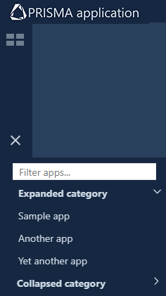
From the app menu, select your favourite apps.
Each app comes with its own workspace
Each app adds a card to the Dock. You can add a new app in the workspace of another running app by dragging the new app from the menu. This special case could force one card to contain information from both apps. You will have to scroll the card's content to switch from one app to the other one
The order of the cards in the dock is kept when you logoff and on again
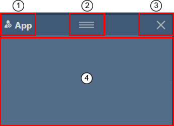
The workspace has a title on the topmost position, usually being the name of the app. The title bar can be hidden, depending on the needs of the application.
When you select one app from the app menu, a new app card with a new workspace is open.
 Card elements
The app name and icon
The icon is optional.
You can change the default title on the card, using the double-click mouse gesture.
The drag-and-drop button
This button only appears when the "long press" gesture is applied or when the mouse cursor is hovering the title-bar of the card.
You can drag the handle icon
to move the card in a different position inside the dock.
The [Close app] button
This button only appears when the "long press" gesture is applied or when the mouse cursor is hovering the title-bar of the card.
The actual content of the card
The cards are primarily used as a navigation through the workspaces. The cards also provide information at a glance about the state of the workspace.
At any given moment, you will have in the card doc area one active card, for the currently visible workspace, and a number of inactive cards.
To close one app, either close the card by the
icon in the corner, or select "[Close app] " from the workspace menu.
The inner content of the card changes when the workspace status requires this. In special cases, the card will signal using a coloured border around the card:
When an app requires attention, its card will receive an orange border.
When an app requires immediate attention, the card will receive a red border.
The workspace is composed out of one or more panels. The panel consists of three distinct areas: Header area, Title area, Content. Like for the workspace, the title can be shown or hidden.
Each panel can be freely moved to a different position in the current workspace. When you hover the mouse over the top of a panel, a handle appears, which can be used to drag the panel to a different position. When rearranging occurs, a drop zone appears to give you a visual indication where it will be placed when the handle is released.
On the top-right corner, the
button can be found. If you press it, the panel is hidden, and the application will reorder the remaining panels. The panel may still send notifications to the card, even if it is hidden. If the workspace only contains one single panel, you cannot hide it.
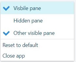
When the mouse cursor is in the top-right corner of the workspace, a menu appears. When the three dots menu
is clicked, a list with all the panels supplied by the app will be shown. The visible panels are marked with a check-mark symbol. Additional entries in this menu are [Close app] and [Reset to default]. When you want to obtain the intended position for all the panels, select [Reset to default] from this menu. If you want to close the app, select [Close app].
All the tables have a header. If the header is visible, and ordering is enabled, the columns can be reordered. Simply drag a column to the desired spot.
The information in a table can be sorted in some of the tables (depending on the providing app). Click the header of a column to sort the whole content of the table using the values in that column once. A second ordering will reverse the sorting order.
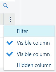
The header of the table offers a context menu from the
button. From this menu, you can check which of the columns to be displayed by the table. The order in which this menu shows the column headers does not change. If you select the [Filter], each column header will receive one input box for content filtering for the values in that column only.
Right above the context menu, you can find the
 filtering button. If pressed, a small text box will allow you to search inside the table, in any of the visible columns.